Knowledge Groups
Wrapping the semester up, I want to take the time to reflect on myself as well as on my knowledge groups. This course has promoted my growth as a person, professional, and designer immensely. I have my amazing professor and peers to thank for that.
Today in class we are meeting up in our knowledge groups to go over final touches, slight tweaks we need opinions on, and just an overall conversation on our sites together as creatives. I’m hoping to get everyone’s honest opinion and advice regardless of being afraid of hurting my feelings. I really want to progress as a designer and have that reflected on my website, and I feel critiques are essential to that progress. I’m also really excited to see everyone’s progress on their sites and share some of what I’ve learned in this journey.
What did I Do In Knowledge Groups?
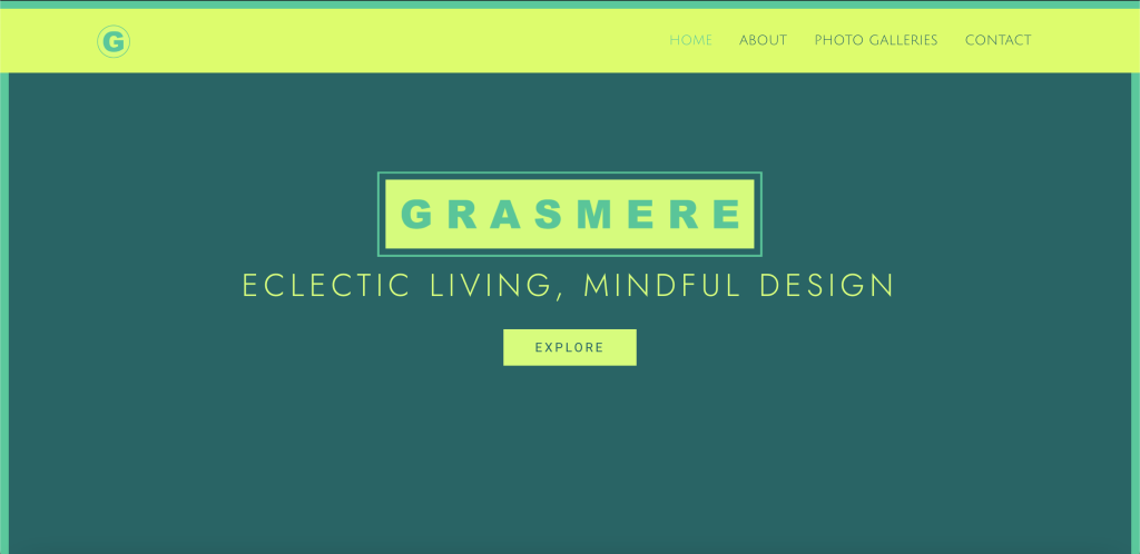
We were able to go over the types of things we still needed to work on (for me that would be the identity of the site on mobile devices). Others, varied, and luckily I could help whenever they were struggling with something I dealt with before. Though, thank god my one of my peers was able to help ME with how to create a user-friendly site identity across mobile devices because, god this site was atrocious on mobile devices. So, from now on, since my desktop version of the site is completed, I will be working on making a just as effective identity across mobile devices which is super exciting!!!
Wrapping the semester up, I want to take the time to reflect on myself as well as on my knowledge groups. This course has promoted my growth as a person, professional, and designer immensely. I have my amazing professor and peers to thank for that.
Today in class we are meeting up in our knowledge groups to go over final touches, slight tweaks we need opinions on, and just an overall conversation on our sites together as creatives. I’m hoping to get everyone’s honest opinion and advice regardless of being afraid of hurting my feelings. I really want to progress as a designer and have that reflected on my website, and I feel critiques are essential to that progress. I’m also really excited to see everyone’s progress on their sites and share some of what I’ve learned in this journey.
What did I Do In Knowledge Groups?
We were able to go over the types of things we still needed to work on (for me that would be the identity of the site on mobile devices). Others, varied, and luckily I could help whenever they were struggling with something I dealt with before. Though, thank god my one of my peers was able to help ME with how to create a user-friendly site identity across mobile devices because, god this site was atrocious on mobile devices. So, from now on, since my desktop version of the site is completed, I will be working on making a just as effective identity across mobile devices which is super exciting!!!