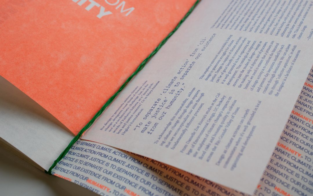
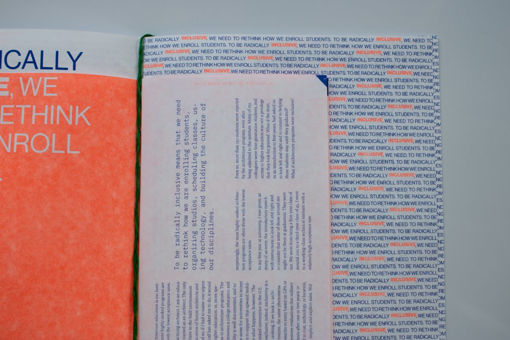
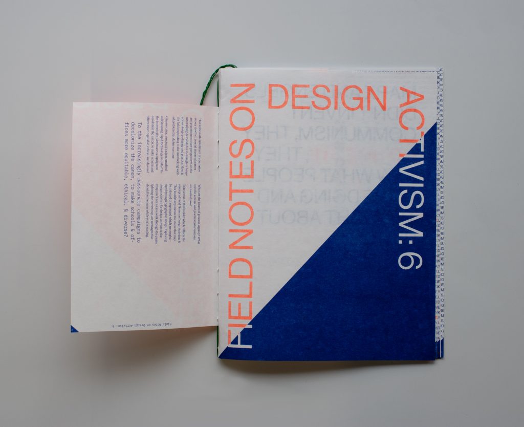
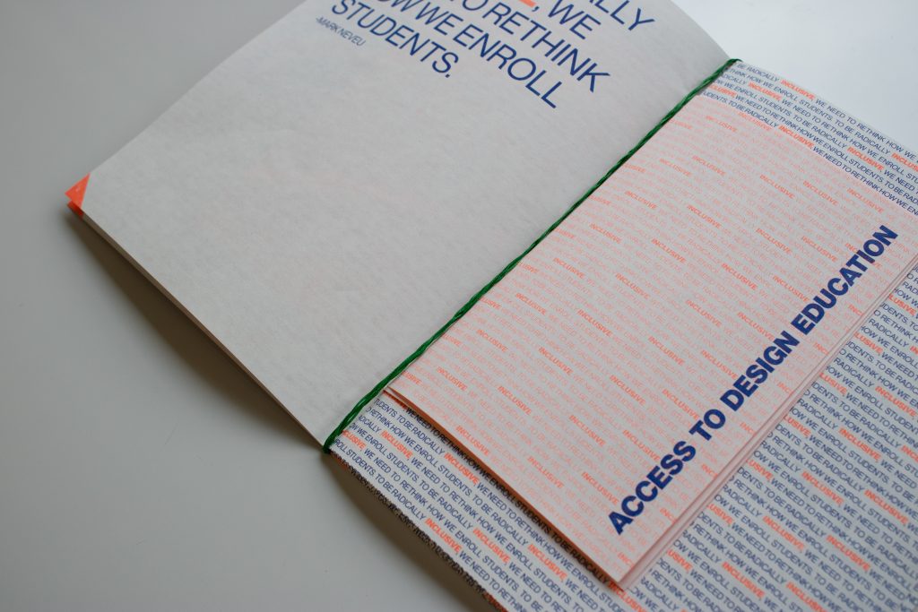
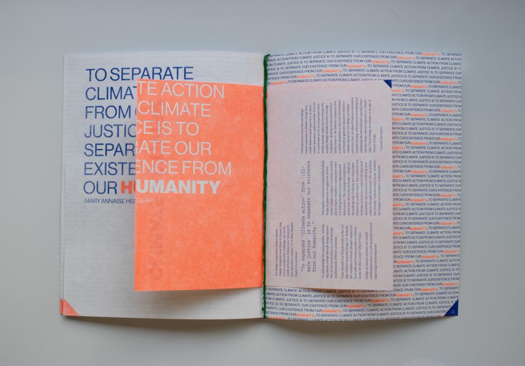
Field Notes on Design Activism:6 has undergone a transformation, emerging as a vibrant, multi-format risograph(riso) booklet, enriched with interactive elements. Through innovative typographical experiments, I utilized type purely as imagery, weaving layers of colors, textures, and the characteristic vibrancy of riso printing to captivate the viewer’s attention. Each section of the booklet is meticulously crafted around highlighted quotes, accompanied by supplementary booklets designed to enhance urgency and clarity for the reader. The overarching intention is to metaphorically “shout” these quotes, directing attention to pressing issues, while the internal booklets serve to offer clarity and synthesis.
It’s crucial to highlight the binding of the booklet, where the conceptual fusion of messages is brought to life through the use of braiding thread. Additionally, I leveraged color theory to underscore the strategic messaging within the booklet. Each color bears a designated representation of activism: the pristine whiteness of the paper symbolizes virtue and freshness, juxtaposed with the blue ink signifying peace and order, accented by touches of orange to evoke immediate reaction. Lastly, the green binding symbolizes growth and new beginnings, further reinforcing the narrative of proactive change and progress.
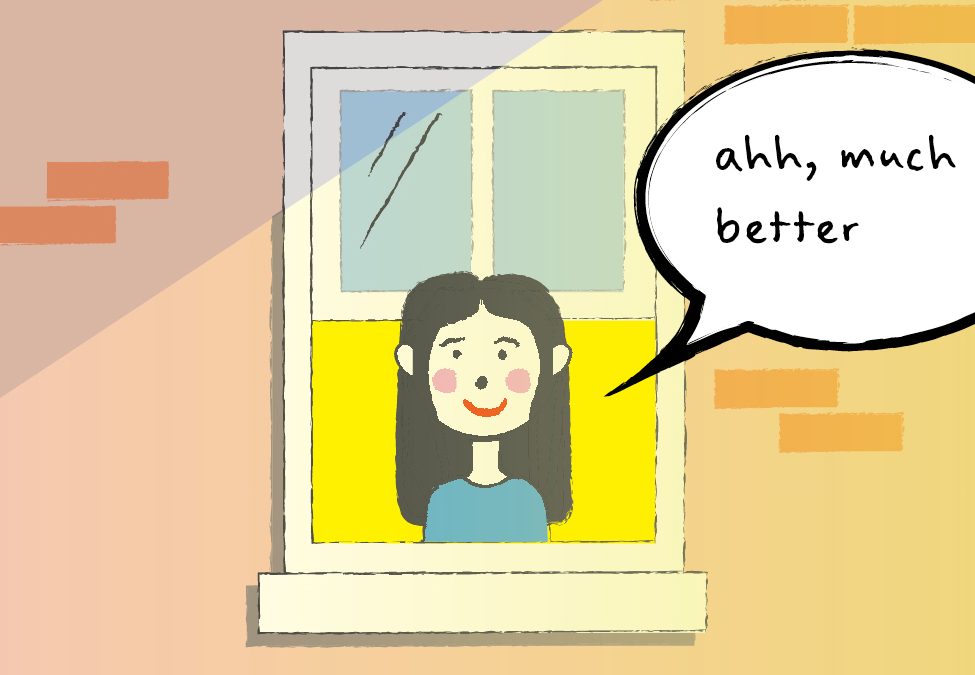
A zine crafted to evoke and celebrate the sense of wonder inspired by the beauty of nature, particularly the sensation of “photosynthesizing as a human.” Basking in sunlight, both within the pages of the zine and in reality, brings about a sense of renewal and vitality. To illustrate this, I employed a dynamic use of color, shifting as if in response to the emergence of the sun and the full embrace of the present moment. The carefully selected quote serves to underscore the significance of the sun, deepening the reader’s appreciation.
In addition to the zine “Embracing the Universal Light of Joy,” I created a captivating GIF that animates the narrative. Utilizing advanced special effects in Adobe After Effects, I meticulously craft each frame to depict a vivid portrayal of life. The animation illustrates the essence of embracing sunlight, engaging in breathwork, and witnessing the transformative effects. Specifically, the emergence of color symbolizes the symbiotic relationship between sunlight and breathwork, offering a myriad of interpretations to the viewer.
In the pursuit of a meaningful life, I find solace in three essential pillars: Peace, Family, and Exploration. I aspire to design an environment where my family can bask in the tranquility of togetherness. Peace, to me, is more than the absence of conflict; it embodies a profound celebration of love and respect. It’s a state where disagreements do not overshadow our appreciation, respect, and reverence for one another.
To translate this aspiration into reality, I have begun a transformative journey toward harmony. Through rigorous research and innovative design experiments, I crafted a compelling motion graphic aimed at inspiring not only my family but also others, urging them to take the necessary steps toward the profound goal of achieving lasting peace.
My research endeavors delve into the heart of a universal query: why does peace, a seemingly simple concept, elude societies across the globe? By investigating this fundamental question, I aim to unravel the complexities hindering global unity. Through the lens of my family’s unique journey, I intend to shed light on the intricate tapestry of challenges and triumphs that constitute the pursuit of peace. My findings unveil that communication, education, empathy, and positive values synergistically create an environment that embodies the essence of what we define as peace.
This project is not just a creative endeavor but a heartfelt exploration, celebrating the resilience of the human spirit and our collective capacity to overcome adversity. Through this multidimensional approach, I hope to inspire individuals and families alike, encouraging them to embark on their transformative journeys toward harmony and unity.
Please explore the many parts to my thesis project and see how they come together to create an overall peace-building experience.
Investigation 1, aptly named “The Heartfelt Hand,” stands as a versatile multi-functional tool for tracking good deeds and expressing gratitude. Its purpose is to cultivate a sense of appreciation and tranquility within any community where it is implemented. The tool’s adaptability is a key feature, as it seamlessly adjusts to the unique characteristics of each community it serves, customizing avatars, context, and reasoning to align with the specific perspectives of those within that community.
In my personalized iteration of “The Heartfelt Hand,” the avatars are symbolized by my family members, and the context and reasoning are intricately tailored to capture the essence of my family’s dynamics, resulting in a deeply personalized and meaningful experience.
During the conceptualization phase of this tool, my paramount objective was to craft a real-time instrument that actively reinforces the core message of my ongoing project. To enhance its effectiveness, I integrated research-backed elements, including effective communication, education and awareness, empathy, and the cultivation of positive values, all seamlessly woven into the context and reasoning of “The Heartfelt Hand.” This approach ensures that the tool serves as a catalyst for fostering gratitude and peace in any community.
Investigation 2, serves as a guiding beacon, steering viewers toward nurturing an intrinsic sense of community that mirrors our collective aspiration for a harmonious environment. Crafted with bespoke visual elements and language tailored for my family, the video transcends familial boundaries, offering a universal appeal that resonates with anyone seeking guidance on contributing to a better world.
By weaving research into my narrative, I effectively convey my message, employing captivating visual storytelling techniques that leverage dynamic motion and graphic assets within the video. This intentional approach ensures not only resonance with viewers but also effectively communicates the core essence of fostering unity and harmony, showcasing the universal relevance of the principles presented.
Moreover, this motion graphic, adapted for my family, is available in both English and Portuguese, intentionally breaking language barriers. Collaborating with my brother, fluent in translating English into a language that resonates best with our Portuguese-speaking family members, ensures inclusivity and accessibility for a wider audience, aligning with the essence of unity portrayed in the video.
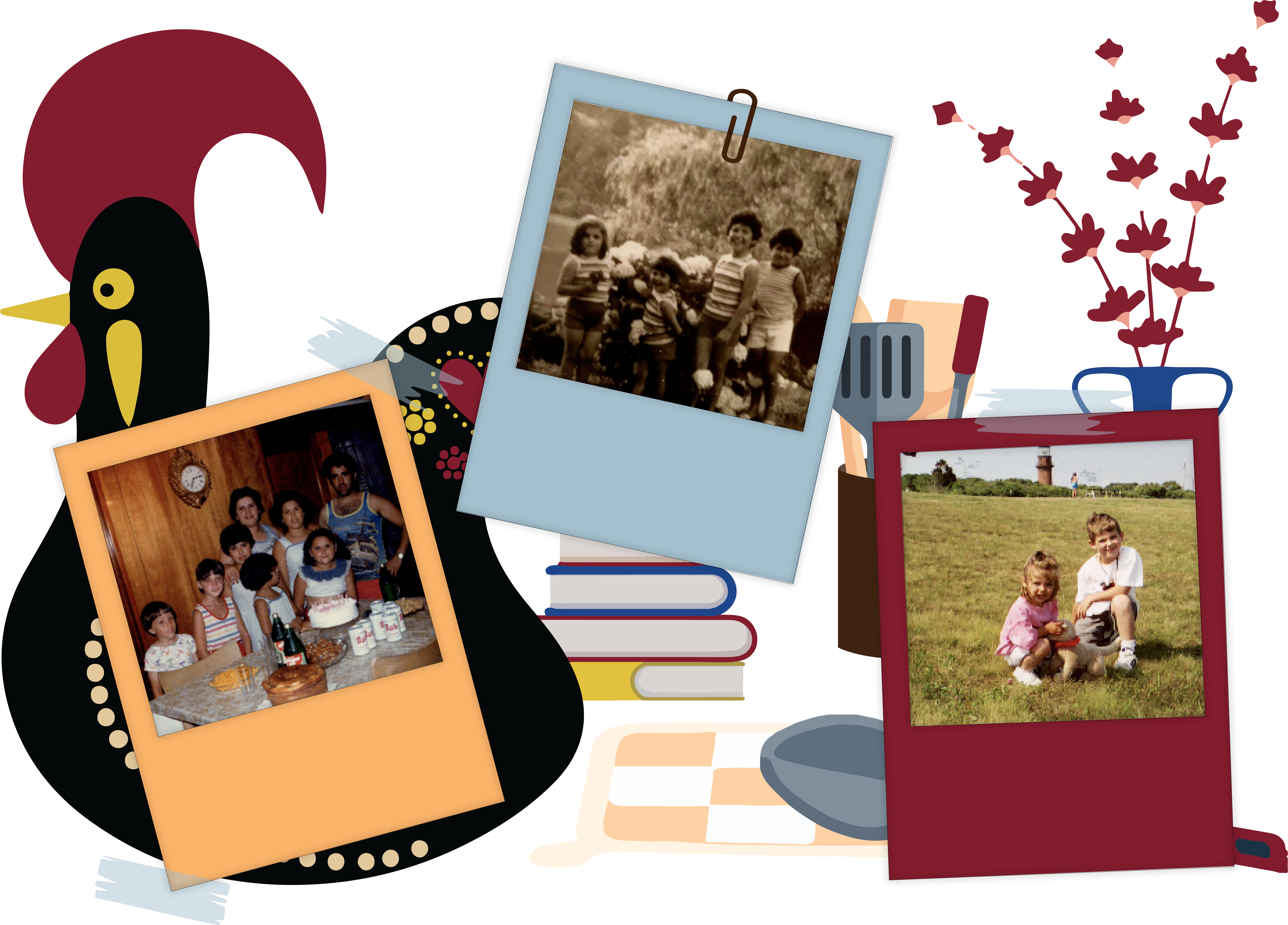
Investigation 3 delved deeper into extensive research and discovery, involving the examination of raw footage, conducting insightful interviews, and employing novel techniques previously unexplored in my creative journey. Drawing from the poignant and unfiltered raw footage captured in the early 2000s, featuring intimate moments within my family, the exploration aimed to illuminate the essence of unification within our dynamics. The resulting portrayal not only offered a glimpse into our familial unity but also sought to extrapolate universal themes, providing viewers with a window into what unification might signify for other families or communities.
Employing interviews conducted within the confines of my own family, I crafted a video that establishes a direct connection with my audience, guiding them through the nuanced process of reconciliation. The incorporation of archival footage from the past not only visually demonstrated the transformative power of unity but also served as a powerful motivator, inspiring viewers to aspire for greater connection and understanding within their own lives.
I also included an interactive piece within my publication that includes two different options (English and Portuguese) that explain verbally the concept and importance behind this project.
This concluding investigation serves as the cohesive force that binds my creative projects together. It acts as the final piece of the puzzle, completing the narrative and delivering a resounding message that resonates with the audience on a personal and universal level.
In conclusion, my research and creative journey represent an exploration of the intertwined pillars of peace, family, and transformation, emphasizing the power of unity and peace. Rooted in a personal commitment to meaningful living, I have delineated a path toward creating an environment that celebrates togetherness. The multifaceted approach involves research, innovative design, and a compelling motion graphic that not only inspires my family but also serves as a call to action for a broader audience to strive for global unity.
By delving into the complexities hindering peace globally, I advocate for open communication, education, empathy, and positive values as crucial elements for sustainable peace-building. This strategy is supported by the incorporation of assumptions and precedents, weaving together a well-crafted definition of peace and a strategic plan drawn from influential publications. The emphasis on effective communication, education, empathy, and the promotion of positive values creates a foundation for journeys toward harmony and unity.
The implications of this research extend beyond individual well-being, touching upon the interconnectedness of personal and global harmony. The designed tools, such as “The Heartfelt Hand,” and the motion graphic video serve as practical manifestations of the research, encouraging gratitude, peace, and community building. Through personal anecdotes, raw footage, and interviews, I bridge the gap between my family’s unique journey and universal themes of unity, inviting viewers to reflect on their own paths toward reconciliation.
During my time as a graphic design intern with International Gaming Technologies (IGT) within the creative service team, I’ve been fortunate to engage in diverse projects spanning various mediums and programs, each serving unique purposes. This opportunity has allowed me to contribute to projects such as conference posters, social media content, email banners, pipeline graphics, and even the 2023 holiday card. Not only have I been able to exhibit my design capabilities here, but I’ve also witnessed significant growth in my skills.
Beyond refining my design prowess, this experience provided a platform for honing my professional soft skills. Collaborating with fellow designers, marketers, and executives, I engaged in numerous presentations and meetings. These interactions allowed me to adeptly present my concepts, designs, and ideas to diverse audiences, receiving valuable feedback, encouragement, motivation, and constructive criticism. This feedback loop enabled me to continually enhance my designs, refine my concepts, and expand my ideation process.
PGRI RMI Feature Graphics:
Commencing this project, I took on the task of creating and curating graphics for an IGT feature in the PGRI magazine. Collaboration played a pivotal role as I worked alongside another designer, striving to maintain a cohesive visual appearance, and collaborated with a marketer to translate content into compelling graphics and infographics. The three graphics presented were meticulously conceptualized, drawing contextual inspiration directly from the article’s substance.
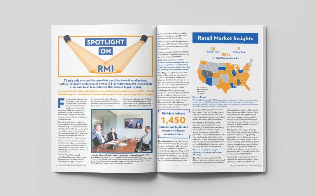
The “Spotlight on RMI” header design was a result of collaborative guidance from the marketer. Utilizing the article’s explicit content, I crafted a design that encapsulated its core message effectively.
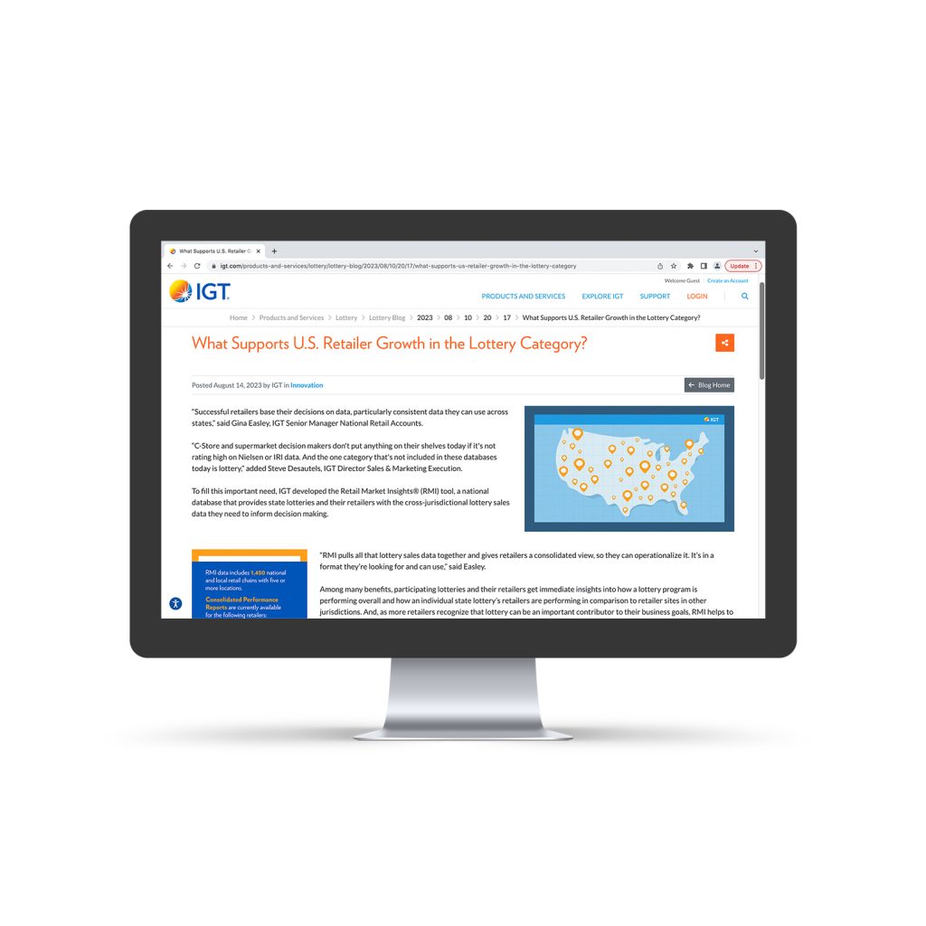
In the Retail Market Insights infographic, I intricately designed a map and information visualization extracted from the article itself. To ensure clarity, I incorporated a visual “key” clarifying the color-coded map segments, distinguishing between active participant states, signed/onboarding states, non-lottery states, and non-RMI states.
The sidebar graphic focusing on RMI from an Operator’s Perspective featured an employee quote, a professional headshot, and relevant employee titles. This design aimed to capture the employee’s viewpoint succinctly.
Learning outcomes from this project encompassed enhanced collaborative skills in maintaining visual consistency within a team, the ability to distill content into visually compelling graphics and infographics, and the precision to encapsulate complex information into clear, accessible visuals. Additionally, it emphasized the importance of understanding and reflecting the essence of content within design elements to effectively communicate the intended message to the audience.
RMI Blog Post Graphics:
Following the completion of the graphics for the magazine feature, our attention promptly turned toward preparing the content for publication on the IGT website’s blog. Adapting the graphics and content from the magazine, I meticulously resized numerous elements to fit precise web dimensions, ensuring a smooth transition to the RGB color mode suitable for online display.
Moreover, I took the initiative to create a unique and captivating thumbnail that encapsulated the essence of the entire article. This thumbnail aimed to serve as a compelling visual representation for the blog post, attracting readers’ attention and conveying the article’s core message effectively.
Learning outcomes from this project encompassed honing my adaptability in resizing graphics for varied platforms, mastering the conversion of color modes for web compatibility, and enhancing my skills in crafting visually impactful thumbnails tailored for online content. Additionally, the project highlighted the importance of maintaining consistency across different mediums while ensuring content remains engaging and visually appealing to the target audience.
ICRG Conference Posters:
I was given the task of designing posters for the ICRG Conference to promote our Sustainable Play campaign. Despite the campaign’s vibrant and lively branding, I faced printer limitations, compelling me to convert the designs to black and white while preserving their visual impact. To ensure the posters maintained their essence, I meticulously recreated the dynamic aesthetic using varying shades of black and white.
In a proactive move, I further improved one of the posters by integrating a QR code. Although the initial request was to showcase the website URL, I believed a QR code would offer a more efficient and engaging way for viewers to access the website directly.
Throughout this project, I had the opportunity to refine my branding skills, delve deeper into the proper conversion of colors to black and white, and advocate for accessibility through the use of QR codes. This experience allowed me to contribute my ideas and insights, particularly emphasizing ease of access for our audience.
International Lottery Retail Workshop Email Banner:
My responsibility was to create an email banner informing employees and customers about an imminent international lottery retail workshop set for November in Italy. When handed this project, the tight deadline demanded completion within just three days. As the workshop belonged to our company’s Lottery sector, I incorporated our distinct lottery branding and crafted icons aligning with the essence of the information presented.
Throughout this project, navigating a remarkably fast turnaround challenged my time management, branding, and design abilities. Despite these obstacles, the experience significantly honed my skills in handling tight deadlines, aligning with brand guidelines, and enhancing design elements.
National Intern Day Social Post:
Our Human Resources specialist focusing on the internship program entrusted me with a dynamic and time-sensitive project tailored for IGT’s interns. Specifically, I was assigned to craft a LinkedIn social media post to commemorate National Intern Day, aiming to express appreciation for the interns at IGT. In creating this post, I aimed for a balance between a playful tone to evoke excitement and maintaining the utmost professionalism in alignment with the IGT brand.
Learning outcomes from this project involved mastering the art of blending playfulness with professionalism in social media communication, adapting messaging to resonate with a specific audience (interns in this case), and honing skills in expressing gratitude and appreciation through concise and engaging social media content. Furthermore, the project highlighted the significance of aligning social media posts with the overarching brand identity and values of the company, ensuring consistency across various communication channels.
Save the Date Open Enrollment Email Banner and Social Post:
Using typography, icons, and color, I crafted an engaging email banner aimed at employees to announce the upcoming open enrollment save-the-date. Despite having ample space but limited content to work with, I creatively utilized typography, icons, and color to highlight and emphasize specific information, allowing for a visually compelling design.
Accompanied with a social post, I took the same content and reformatted the information into the dimensions needed for a social media post!
Learning outcomes from this project encompassed leveraging design elements such as typography, icons, and color to effectively communicate information within limited content space. It involved refining skills in visual hierarchy, emphasizing key details, and creating an engaging visual narrative that captures attention and conveys essential information. Additionally, this project provided insights into maximizing design impact through strategic use of space and elements, enhancing communication effectiveness in digital marketing materials like email banners.
IGT 2023 Holiday Card:
One of the most rewarding projects of this semester was crafting the 2023 IGT Holiday Card. My role involved designing and creating a holiday card adaptable to numerous formats: site portals, social media posts, GIFs, footers, and more. This task presented unique challenges as I worked within the context of a Business-to-Business global company. I had to maintain brand consistency while steering clear of seasonal, religious, or exclusive themes, all while ensuring the card encapsulated a festive ambiance that resonated universally. Leveraging color palettes and shapes, I successfully crafted an engaging and inclusive holiday card.
Throughout this project, I was responsible for creating the primary card design, an animated version tailored for emails, a footer design, social media posts, a microsite header, and a website portal graphic. Additionally, I managed the translation of these designs into multiple languages, including Italian and Spanish versions for all mediums.
The learning outcomes from this project were invaluable. It strengthened my ability to navigate complex design challenges within a corporate setting, emphasizing inclusivity while adhering to brand guidelines and avoiding potentially sensitive themes. Working across various formats and languages honed my adaptability and versatility in design execution, ensuring a consistent message across diverse audiences. Moreover, this project underscored the significance of visual communication in evoking a festive atmosphere while maintaining a neutral and inclusive tone across a global business landscape.