
field notes on design activism: 6
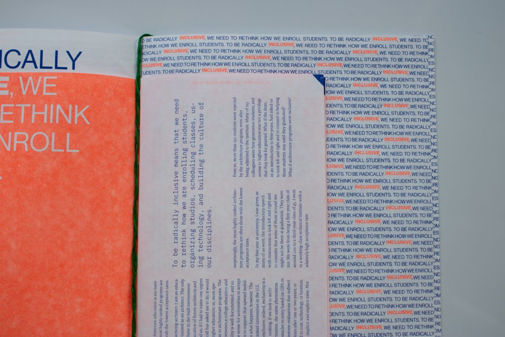

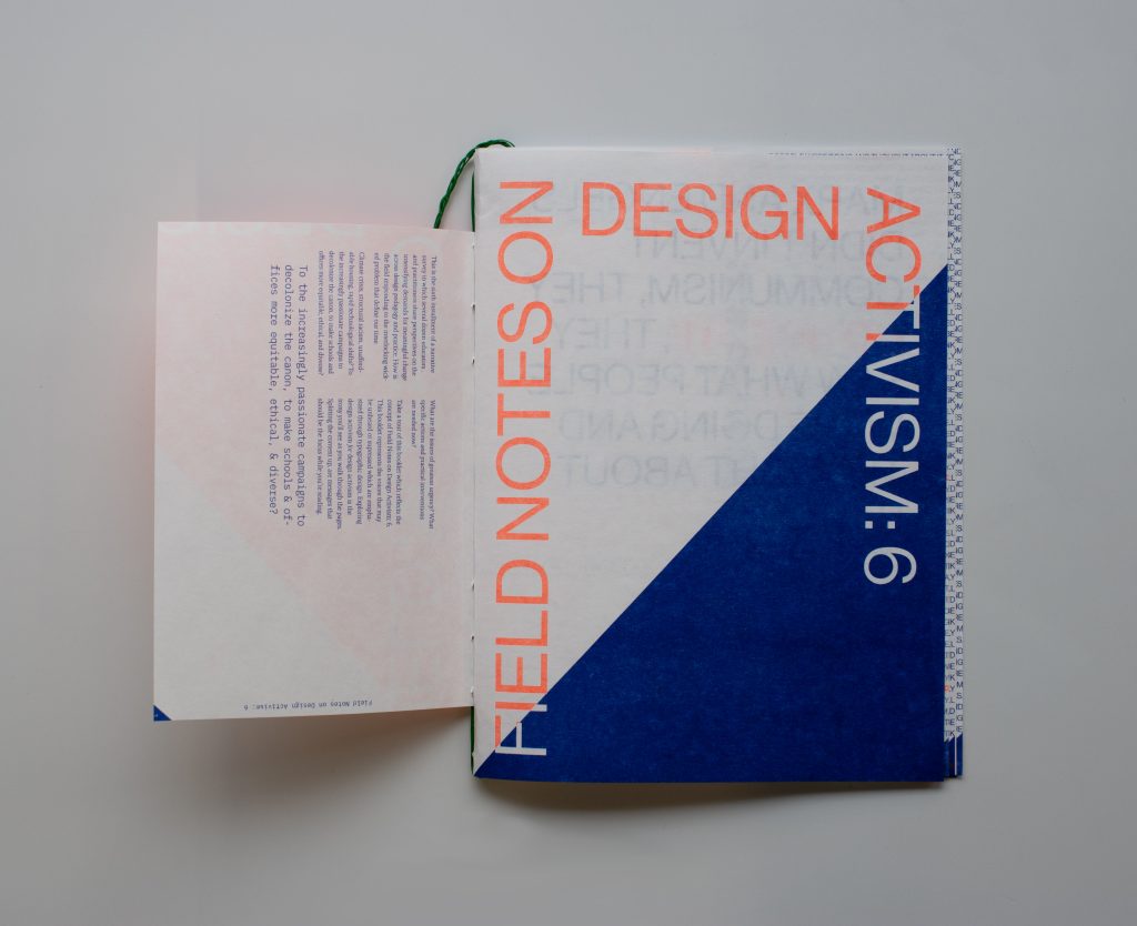


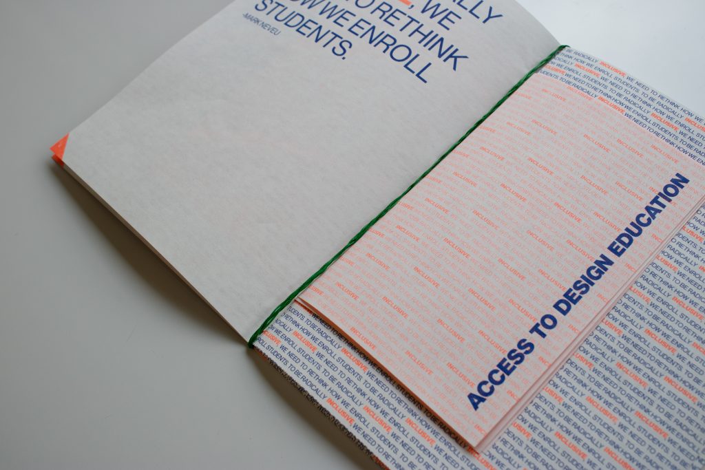
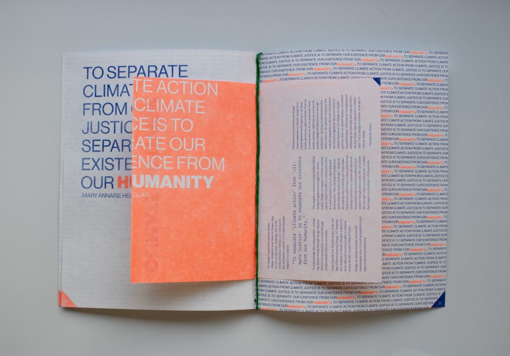

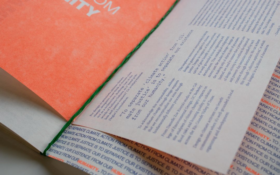
Field Notes on Design Activism:6 has undergone a transformation, emerging as a vibrant, multi-format risograph(riso) booklet, enriched with interactive elements. Through innovative
typographical experiments, I utilized type purely as imagery, weaving layers of colors, textures, and the characteristic vibrancy of riso printing to captivate the viewer’s attention. Each section of the booklet is meticulously crafted around highlighted quotes, accompanied by supplementary booklets designed to enhance urgency and clarity for the reader. The overarching intention is to metaphorically “shout” these quotes, directing attention to pressing issues, while the internal booklets serve to offer clarity and synthesis.
It’s crucial to highlight the binding of the booklet, where the conceptual fusion of messages is brought to life through the use of braiding thread. Additionally, I leveraged color theory to underscore the strategic messaging within the booklet. Each color bears a designated representation of activism: the pristine whiteness of the paper symbolizes virtue and freshness, juxtaposed with the blue ink signifying peace and order, accented by touches of orange to evoke immediate reaction. Lastly, the green binding symbolizes growth and new beginnings, further reinforcing the narrative of proactive change and progress.