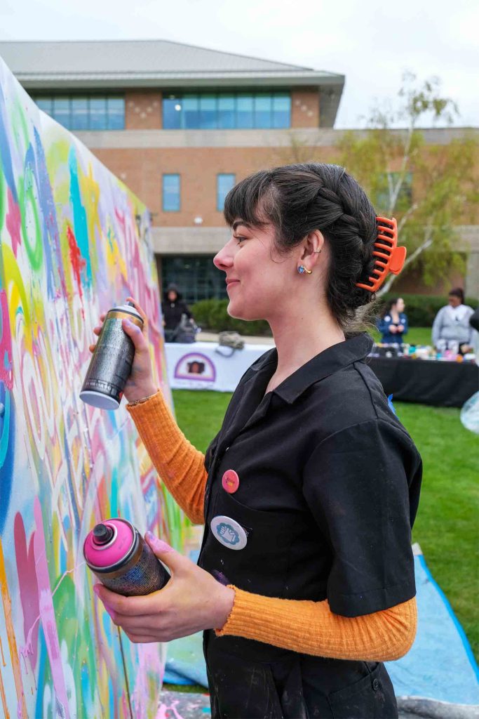
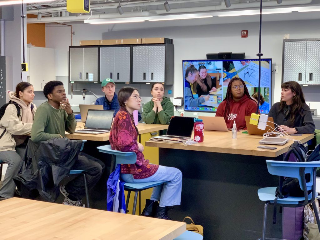
As the lead researcher and designer of this grant-funded project, I worked together with peers to conduct research on campus perceptions of diversity, equity, and inclusion (DEI). Through the course of the academic year, we explored how to actively engage in building unity through collaborative practice with various affinity groups, including the Multicultural Student Union (MSU), Hispanic American and Latinx Student Association (HALSA), Asian American Alliance (AAA), Women of Color Club (WOCC), Rhythm n’ Roots (RnR), The Barbershop, and Hillel International.
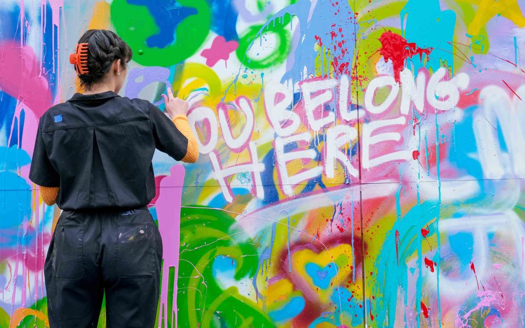
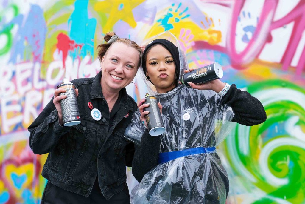
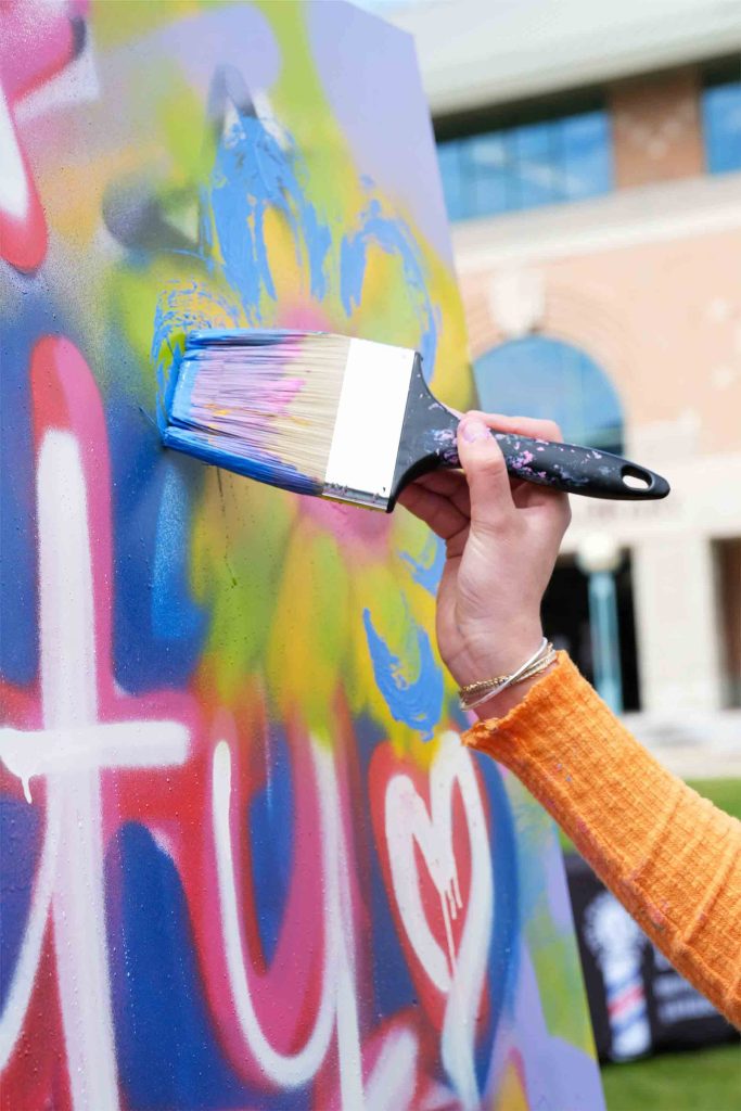
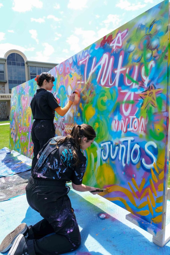
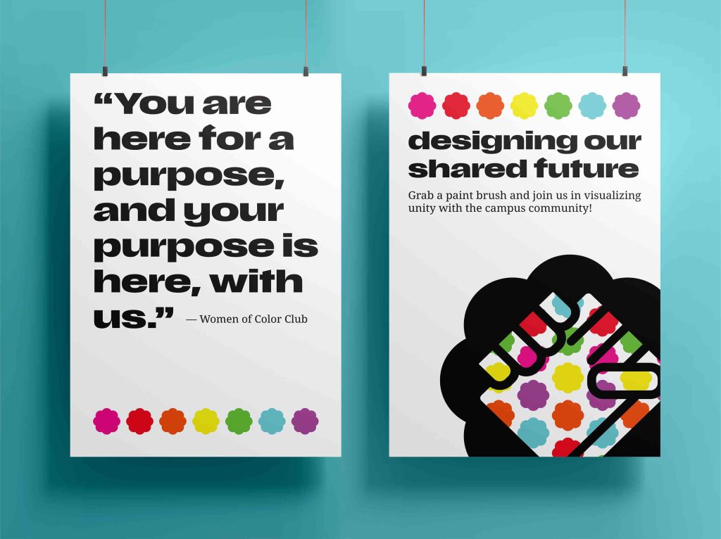
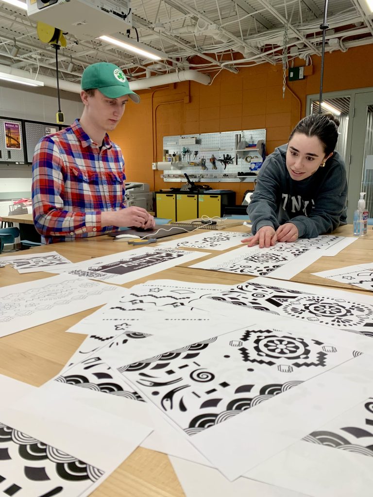
We also conducted semiotic studies of pattern, color, and repetition based on a quote gathered from WOCC, “You’re here for a purpose, and your purpose is here, with us.” These visual studies led to the creation of a single mural representing our collective effort to build a better campus and unified world for all students, faculty, and staff.
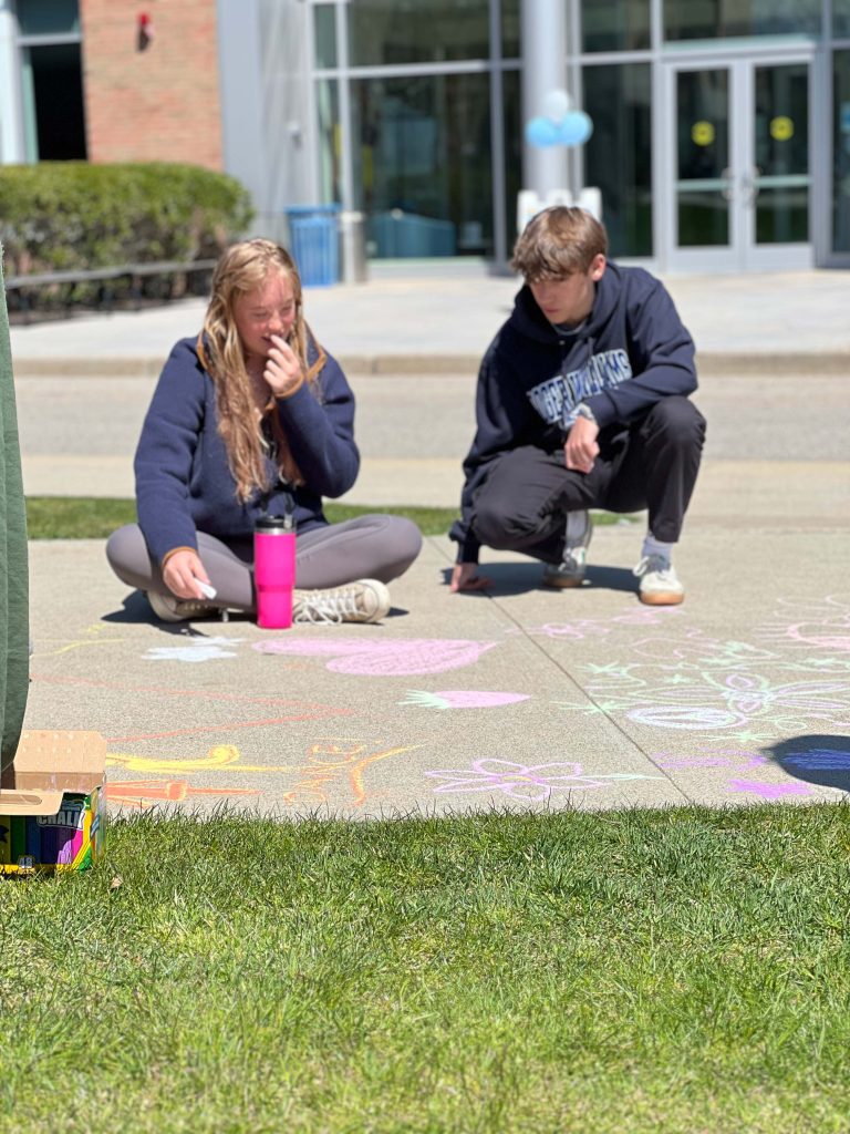
Through the symbols and patterns the design team created inspired by the affinity groups, the campus-wide community were welcomed to contribute their unique interpretation of unity to the mural.
promotional materials
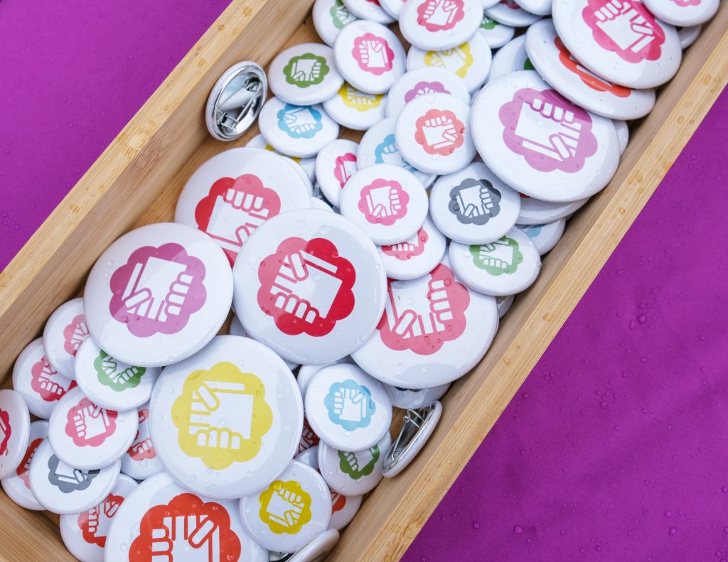
In exploring the concept of unity, our design team engaged in research with affinity-based groups across campus. From this collaboration, we curated bespoke symbols and patterns reflecting unity through diverse cultural, religious, and demographic perspectives. To generate interest and participation, I crafted posters aligned with our brand identity, drawing attention from passersby and effectively bolstering event attendance.
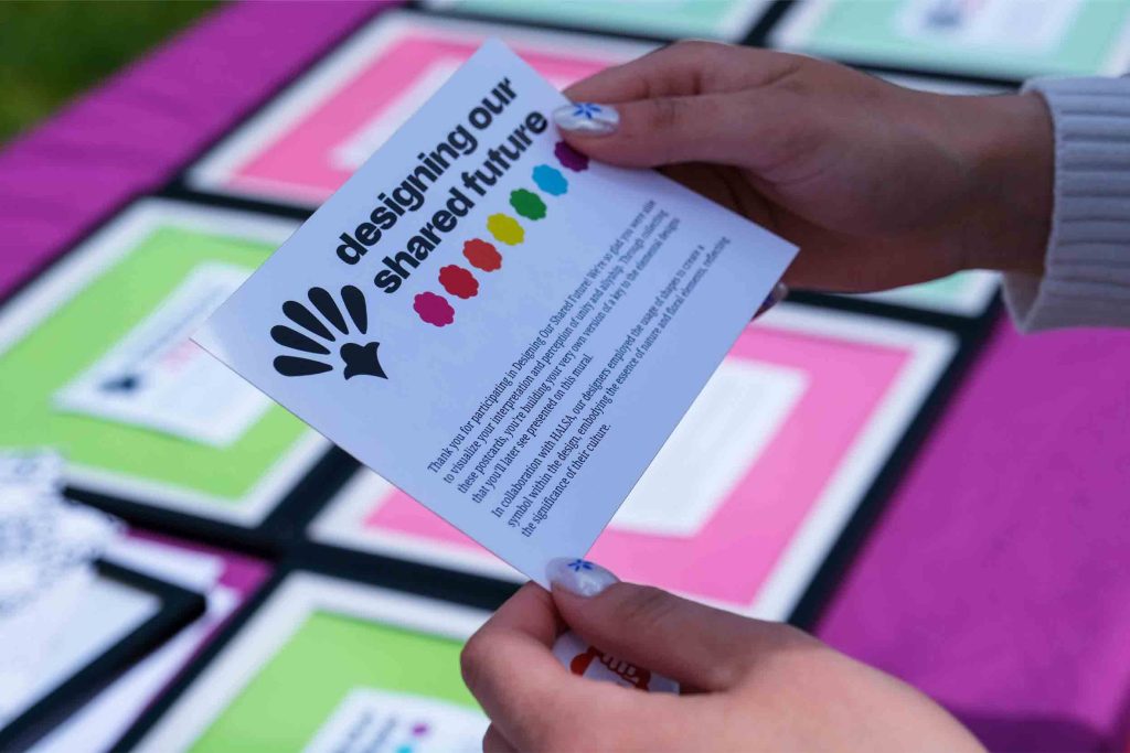
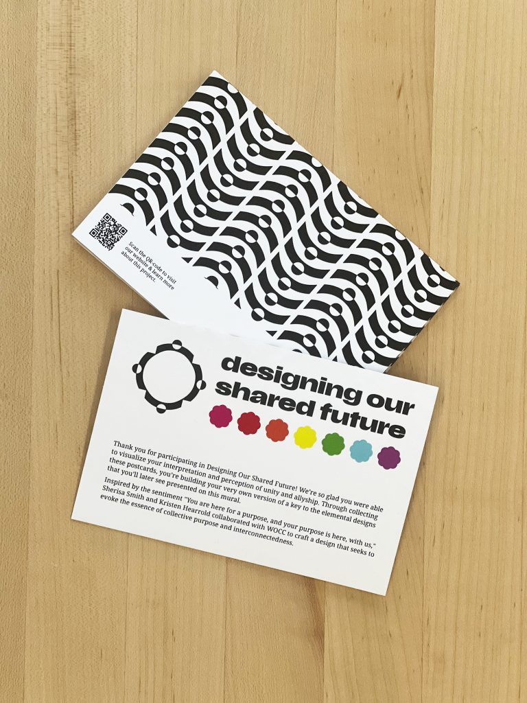
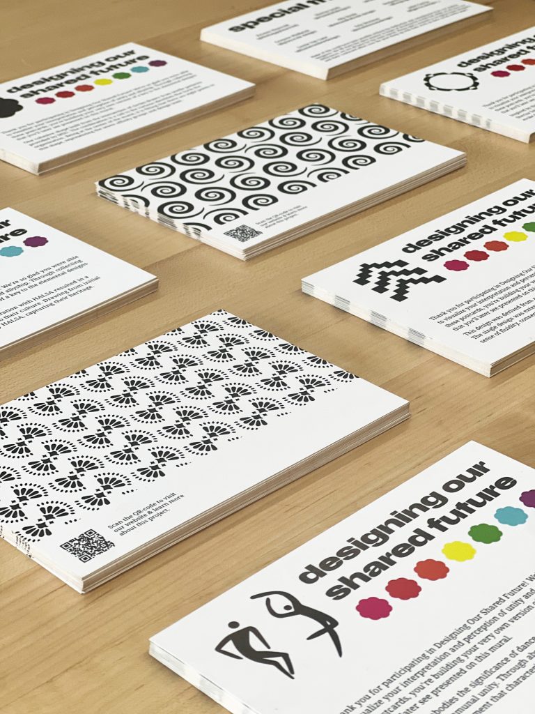
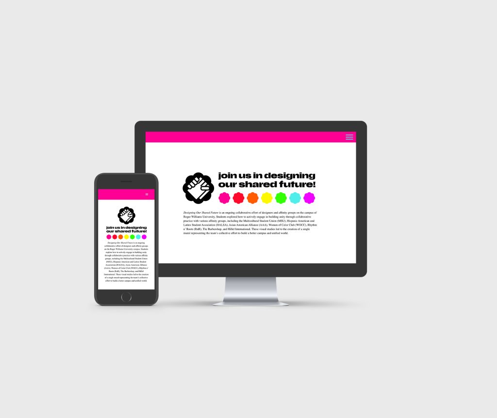
For the day of the event, I developed postcard takeaways for participants, serving as both inspiration and a curated guide to the symbolism embedded in each design. With detailed explanations provided, attendees delved deeper into the project’s goals and outcomes via a QR code linked to our website. This interactive approach facilitated further exploration and engagement with the themes of unity and diversity.
web design
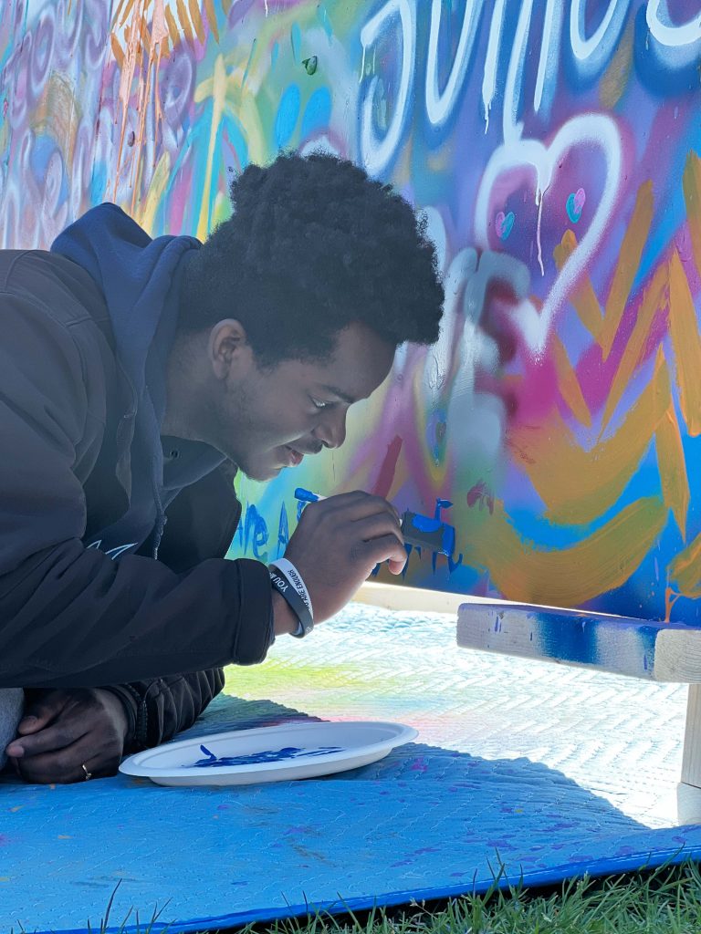
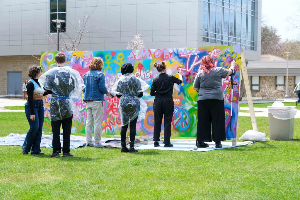
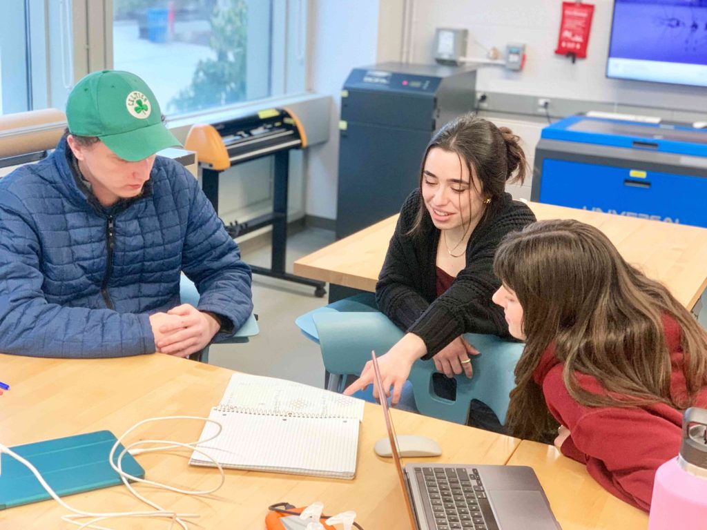
As a core aspect of the project, our team was committed to maintaining complete transparency, enabling both viewers and participants to gain insights into the project’s journey. This encompassed showcasing a multitude of tasks integral to the project, ranging from conducting interviews and constructing the piece, to curating designs tailored for each group, all the way through to the event day itself.
process
In collaboration with Sherisa Smith, Hannah Caple, Alexandra Houle, Ben Mosher, and Grayson Philbrick.
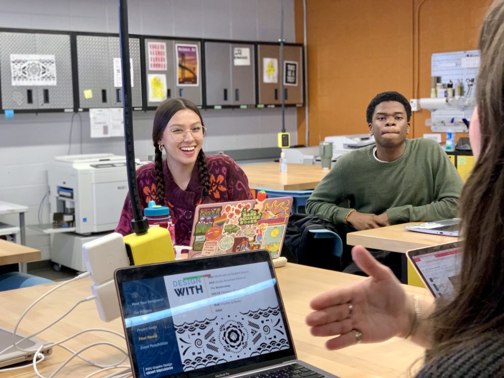
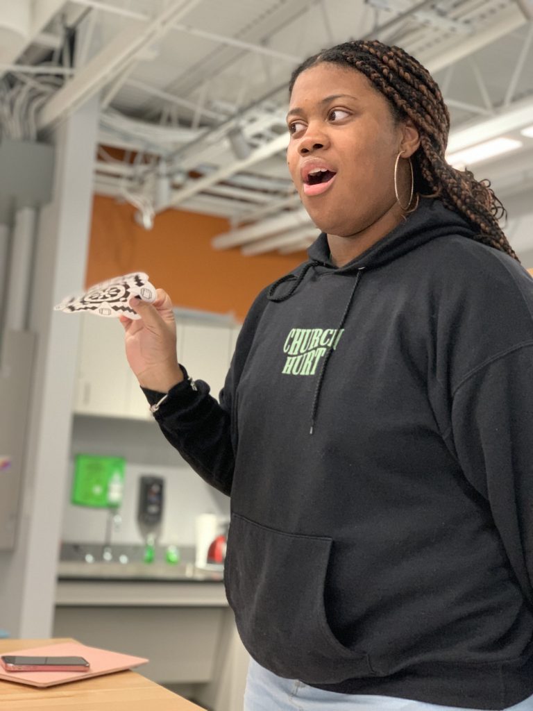
The process of this project included layers of collaboration, research, construction, and did I say collaboration? Our design team partnered with campus affinity groups, allowing each designer to choose one or two groups to collaborate with. Through interviews, questionnaires, and open conversations, we explored each group’s perspectives and needs related to the project.
Once the research phase was complete, we transitioned into the production stage. Designers created patterns and symbols based on the insights gathered, iterating on their designs while continuing to collaborate with the groups. To ensure the participants felt deeply connected to the final designs, we held critique sessions for feedback, refining the patterns and symbols that would inspire the mural on painting day.
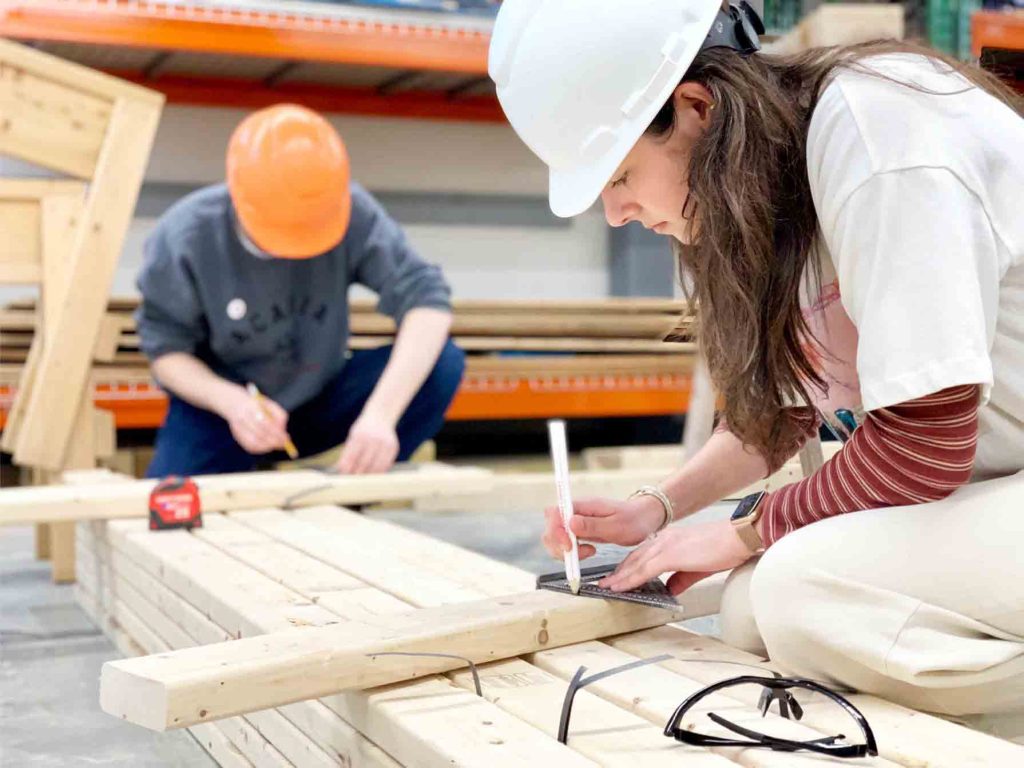
In preparation for the mural installation, we teamed up with the campus construction management club to help design and build the structure. They advised us on the best materials, and as the project was highly hands-on, our design team worked alongside them to construct and install the mural panels into their permanent location.
During my time as a graphic design intern with International Gaming Technologies (IGT) within the creative service team, I’ve been fortunate to engage in diverse projects spanning various mediums and programs, each serving unique purposes. This opportunity has allowed me to contribute to projects such as conference posters, social media content, email banners, pipeline graphics, and even the 2023 holiday card. Not only have I been able to exhibit my design capabilities here, but I’ve also witnessed significant growth in my skills.
Beyond refining my design prowess, this experience provided a platform for honing my professional soft skills. Collaborating with fellow designers, marketers, and executives, I engaged in numerous presentations and meetings. These interactions allowed me to adeptly present my concepts, designs, and ideas to diverse audiences, receiving valuable feedback, encouragement, motivation, and constructive criticism. This feedback loop enabled me to continually enhance my designs, refine my concepts, and expand my ideation process.
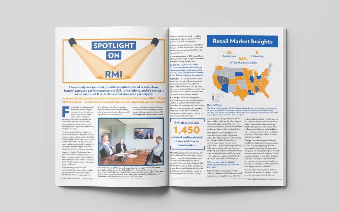
PGRI RMI Feature Graphics:
Commencing this project, I took on the task of creating and curating graphics for an IGT feature in the PGRI magazine. Collaboration played a pivotal role as I worked alongside another designer, striving to maintain a cohesive visual appearance, and collaborated with a marketer to translate content into compelling graphics and infographics. The three graphics presented were meticulously conceptualized, drawing contextual inspiration directly from the article’s substance.
The “Spotlight on RMI” header design was a result of collaborative guidance from the marketer. Utilizing the article’s explicit content, I crafted a design that encapsulated its core message effectively.
In the Retail Market Insights infographic, I intricately designed a map and information visualization extracted from the article itself. To ensure clarity, I incorporated a visual “key” clarifying the color-coded map segments, distinguishing between active participant states, signed/onboarding states, non-lottery states, and non-RMI states.
The sidebar graphic focusing on RMI from an Operator’s Perspective featured an employee quote, a professional headshot, and relevant employee titles. This design aimed to capture the employee’s viewpoint succinctly.
Learning outcomes from this project encompassed enhanced collaborative skills in maintaining visual consistency within a team, the ability to distill content into visually compelling graphics and infographics, and the precision to encapsulate complex information into clear, accessible visuals. Additionally, it emphasized the importance of understanding and reflecting the essence of content within design elements to effectively communicate the intended message to the audience.
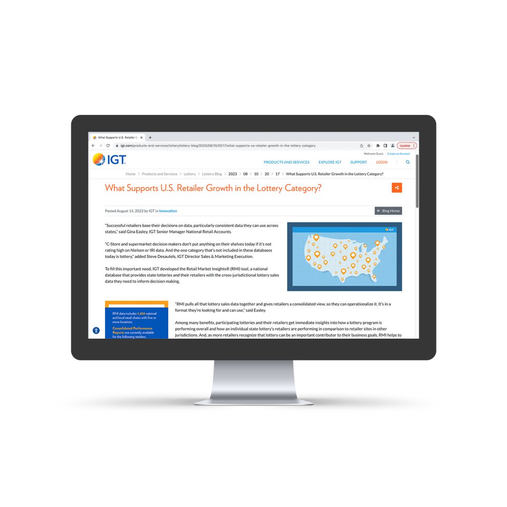
RMI Blog Post Graphics:
Following the completion of the graphics for the magazine feature, our attention promptly turned toward preparing the content for publication on the IGT website’s blog. Adapting the graphics and content from the magazine, I meticulously resized numerous elements to fit precise web dimensions, ensuring a smooth transition to the RGB color mode suitable for online display.
Moreover, I took the initiative to create a unique and captivating thumbnail that encapsulated the essence of the entire article. This thumbnail aimed to serve as a compelling visual representation for the blog post, attracting readers’ attention and conveying the article’s core message effectively.
Learning outcomes from this project encompassed honing my adaptability in resizing graphics for varied platforms, mastering the conversion of color modes for web compatibility, and enhancing my skills in crafting visually impactful thumbnails tailored for online content. Additionally, the project highlighted the importance of maintaining consistency across different mediums while ensuring content remains engaging and visually appealing to the target audience.
ICRG Conference Posters:
I was given the task of designing posters for the ICRG Conference to promote our Sustainable Play campaign. Despite the campaign’s vibrant and lively branding, I faced printer limitations, compelling me to convert the designs to black and white while preserving their visual impact. To ensure the posters maintained their essence, I meticulously recreated the dynamic aesthetic using varying shades of black and white.
In a proactive move, I further improved one of the posters by integrating a QR code. Although the initial request was to showcase the website URL, I believed a QR code would offer a more efficient and engaging way for viewers to access the website directly.
Throughout this project, I had the opportunity to refine my branding skills, delve deeper into the proper conversion of colors to black and white, and advocate for accessibility through the use of QR codes. This experience allowed me to contribute my ideas and insights, particularly emphasizing ease of access for our audience.
International Lottery Retail Workshop Email Banner:
My responsibility was to create an email banner informing employees and customers about an imminent international lottery retail workshop set for November in Italy. When handed this project, the tight deadline demanded completion within just three days. As the workshop belonged to our company’s Lottery sector, I incorporated our distinct lottery branding and crafted icons aligning with the essence of the information presented.
Throughout this project, navigating a remarkably fast turnaround challenged my time management, branding, and design abilities. Despite these obstacles, the experience significantly honed my skills in handling tight deadlines, aligning with brand guidelines, and enhancing design elements.
National Intern Day Social Post:
Our Human Resources specialist focusing on the internship program entrusted me with a dynamic and time-sensitive project tailored for IGT’s interns. Specifically, I was assigned to craft a LinkedIn social media post to commemorate National Intern Day, aiming to express appreciation for the interns at IGT. In creating this post, I aimed for a balance between a playful tone to evoke excitement and maintaining the utmost professionalism in alignment with the IGT brand.
Learning outcomes from this project involved mastering the art of blending playfulness with professionalism in social media communication, adapting messaging to resonate with a specific audience (interns in this case), and honing skills in expressing gratitude and appreciation through concise and engaging social media content. Furthermore, the project highlighted the significance of aligning social media posts with the overarching brand identity and values of the company, ensuring consistency across various communication channels.
Save the Date Open Enrollment Email Banner and Social Post:
Using typography, icons, and color, I crafted an engaging email banner aimed at employees to announce the upcoming open enrollment save-the-date. Despite having ample space but limited content to work with, I creatively utilized typography, icons, and color to highlight and emphasize specific information, allowing for a visually compelling design.
Accompanied with a social post, I took the same content and reformatted the information into the dimensions needed for a social media post!
Learning outcomes from this project encompassed leveraging design elements such as typography, icons, and color to effectively communicate information within limited content space. It involved refining skills in visual hierarchy, emphasizing key details, and creating an engaging visual narrative that captures attention and conveys essential information. Additionally, this project provided insights into maximizing design impact through strategic use of space and elements, enhancing communication effectiveness in digital marketing materials like email banners.
IGT 2023 Holiday Card:
One of the most rewarding projects of this semester was crafting the 2023 IGT Holiday Card. My role involved designing and creating a holiday card adaptable to numerous formats: site portals, social media posts, GIFs, footers, and more. This task presented unique challenges as I worked within the context of a Business-to-Business global company. I had to maintain brand consistency while steering clear of seasonal, religious, or exclusive themes, all while ensuring the card encapsulated a festive ambiance that resonated universally. Leveraging color palettes and shapes, I successfully crafted an engaging and inclusive holiday card.
Throughout this project, I was responsible for creating the primary card design, an animated version tailored for emails, a footer design, social media posts, a microsite header, and a website portal graphic. Additionally, I managed the translation of these designs into multiple languages, including Italian and Spanish versions for all mediums.
The learning outcomes from this project were invaluable. It strengthened my ability to navigate complex design challenges within a corporate setting, emphasizing inclusivity while adhering to brand guidelines and avoiding potentially sensitive themes. Working across various formats and languages honed my adaptability and versatility in design execution, ensuring a consistent message across diverse audiences. Moreover, this project underscored the significance of visual communication in evoking a festive atmosphere while maintaining a neutral and inclusive tone across a global business landscape.