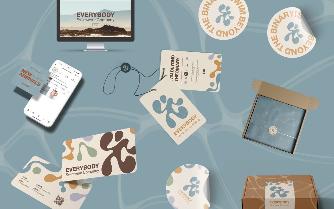
Everybody Swimwear is a gender-inclusive swimwear brand dedicated to empowering individuals to feel comfortable and confident in their bodies. Focused on inclusivity, the company provides options that cater particularly to LGBTQ+ individuals and those who prefer androgynous styles.
For this project, I developed a cohesive brand identity that communicates the company’s core values of inclusivity, comfort, and empowerment. The visual elements include fluid, organic shapes in the logo and patterns, symbolizing diversity, body positivity, and freedom, which are featured across packaging, tags, and promotional materials. A mix of soft earth tones and bold accents in the color palette creates a welcoming and modern aesthetic, appealing to a broad audience. Playful yet clear messaging, such as “Swim Beyond the Binary!”, reinforces the brand’s mission to break stereotypes and celebrate individuality.
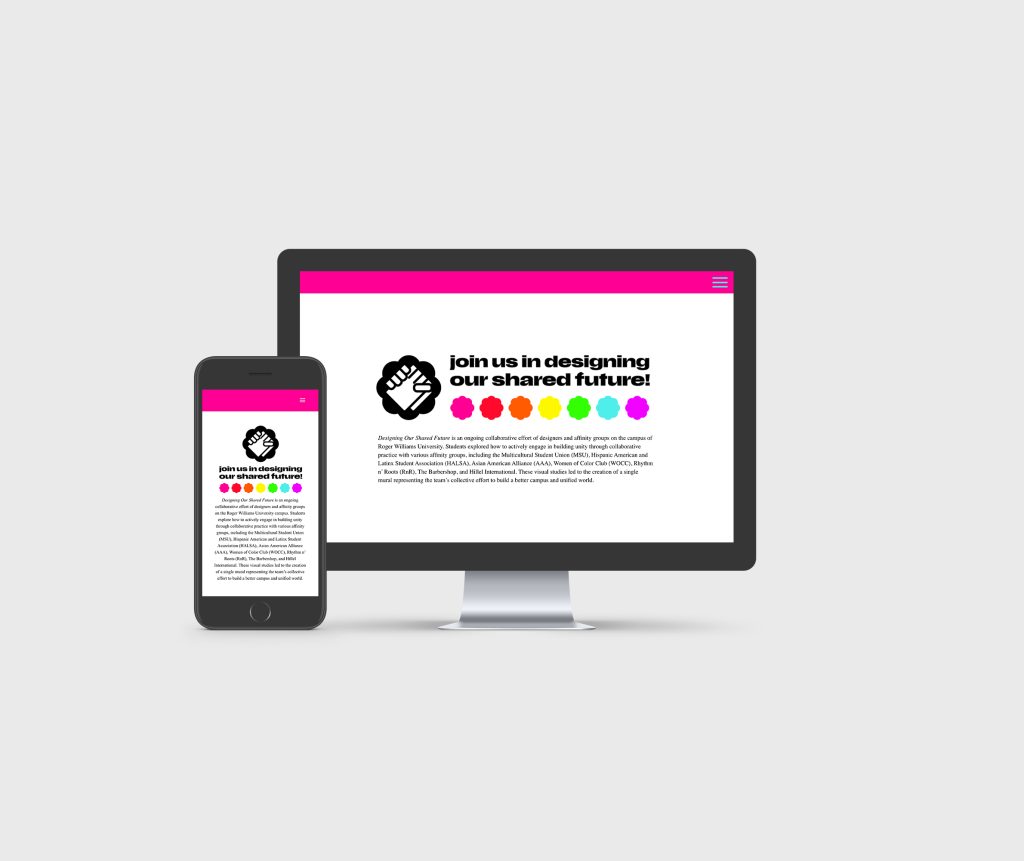
The digital presence was designed with the same inclusive ethos, ensuring a seamless, engaging experience for customers through both the website and social media platforms.
Additionally, the sustainable, beautifully branded packaging enhances the customer experience while aligning with the brand’s values.
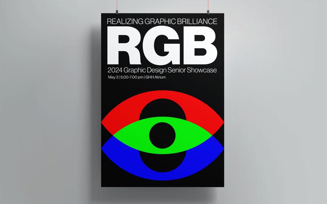
As part of our Senior Portfolio course, the annual senior showcase is a requirement for graduation in design studies. Integrated into the curriculum, each student is tasked with creating a brand identity centered around the exhibition theme and collectively selects the identity to represent the event.
The identity I crafted for “RGB: Realizing Graphic Brilliance” was chosen to embody the theme of the exhibition. Drawing inspiration from the RGB web colors and the notion of realizing graphic brilliance, my design revolves around typographic elements intertwined with illustrations of the third eye, symbolizing the awakening or realization of creative potential.
My identity encompasses a range of collateral, including posters, buttons, cookies, stickers, and interactive features integrated into the exhibition space. Each aspect of the identity is meticulously designed to enhance the viewer’s experience and engagement.
Moreover, I structured the exhibition around the three letters of RGB, with each letter representing a thematic section: R for Responsive Web Design, G for Games and Activities, and B for Books and Publications. This cohesive approach ensures that the exhibition is not only visually compelling but also conceptually rich and immersive for attendees.
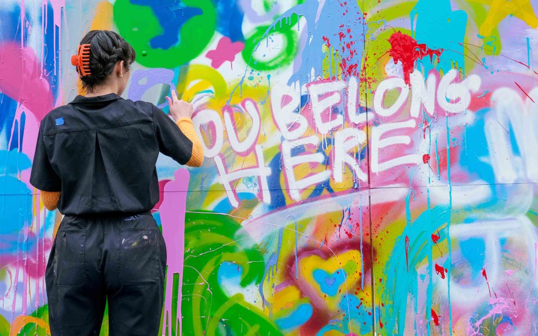
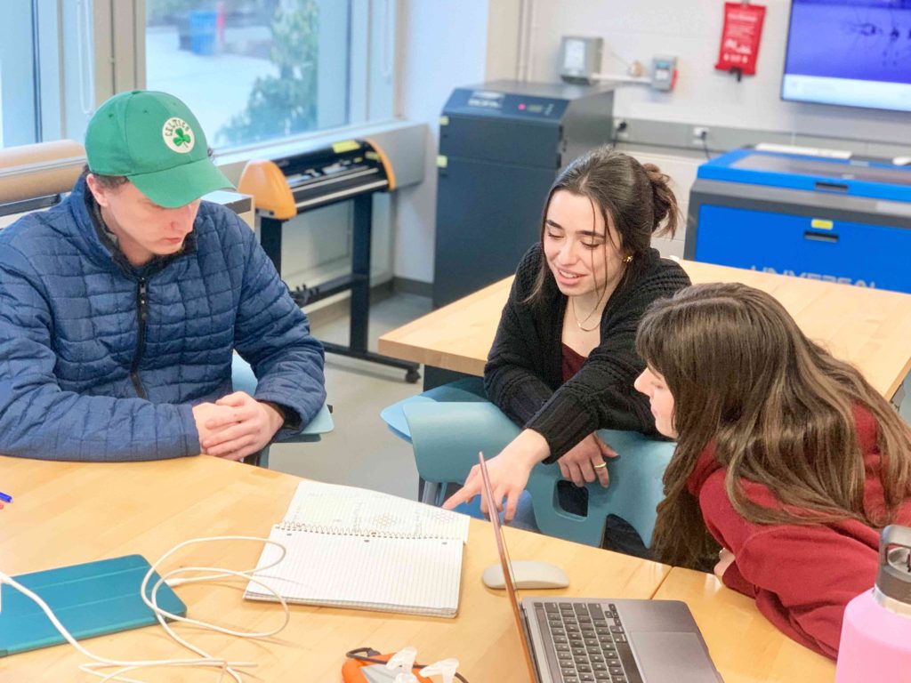
As the lead researcher and designer of this grant-funded project, I worked together with peers to conduct research on campus perceptions of diversity, equity, and inclusion (DEI). Through the course of the academic year, we explored how to actively engage in building unity through collaborative practice with various affinity groups, including the Multicultural Student Union (MSU), Hispanic American and Latinx Student Association (HALSA), Asian American Alliance (AAA), Women of Color Club (WOCC), Rhythm n’ Roots (RnR), The Barbershop, and Hillel International.
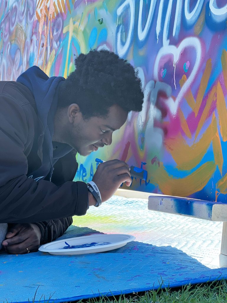
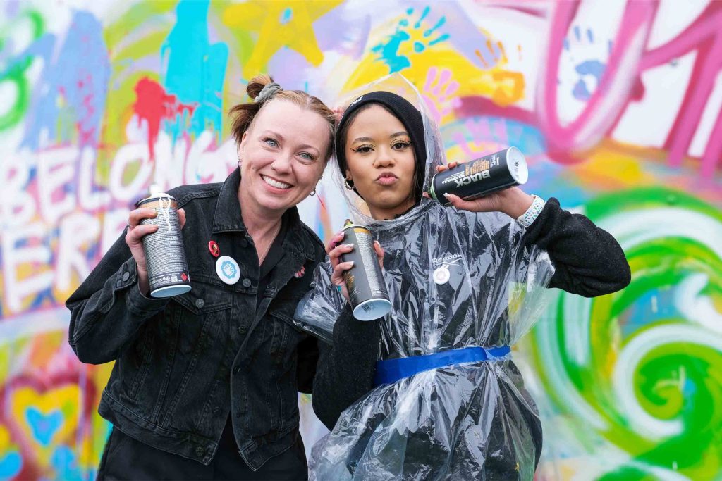
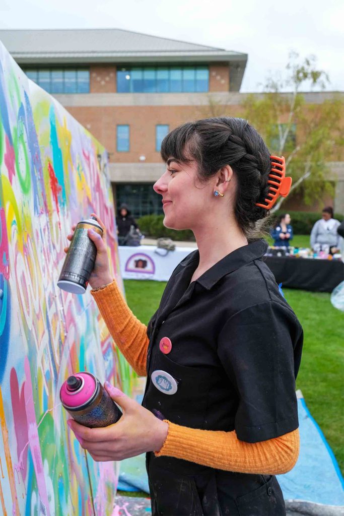
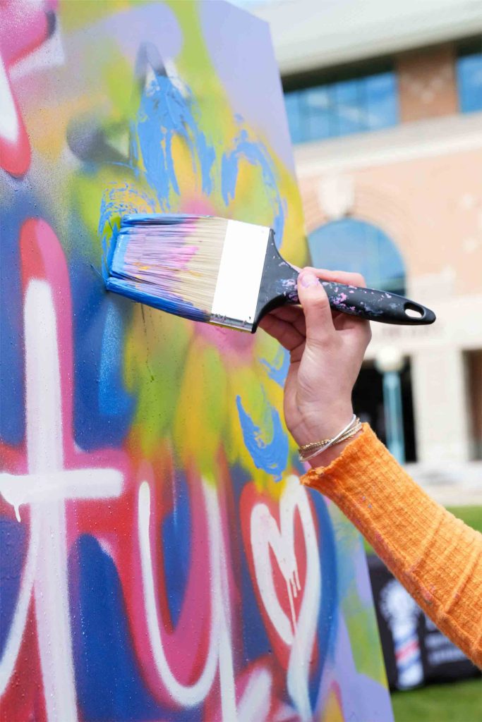
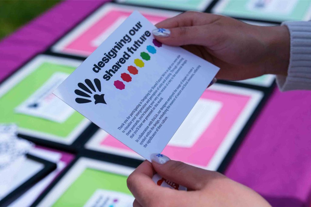
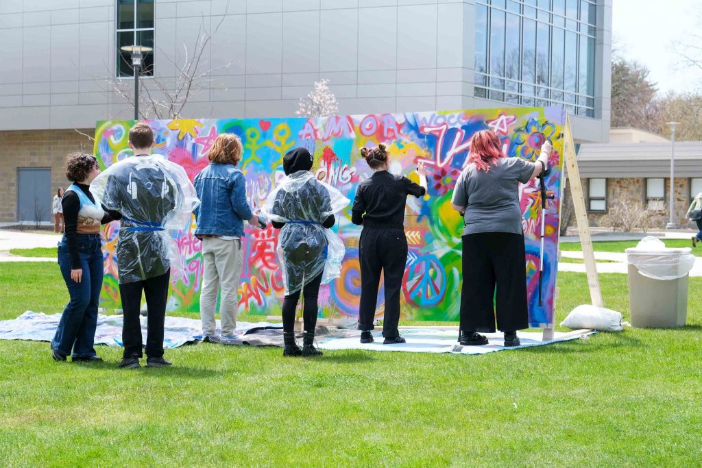
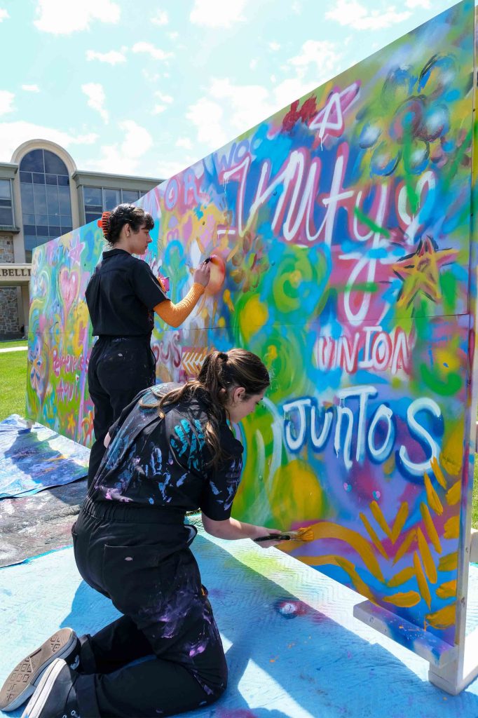
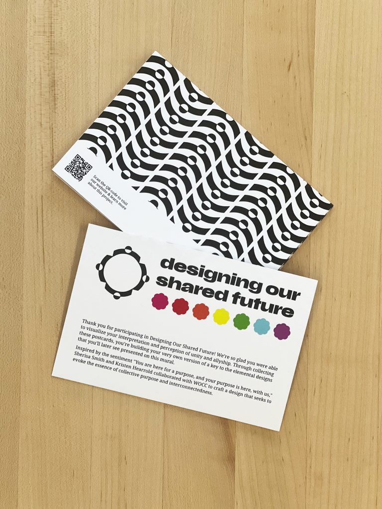
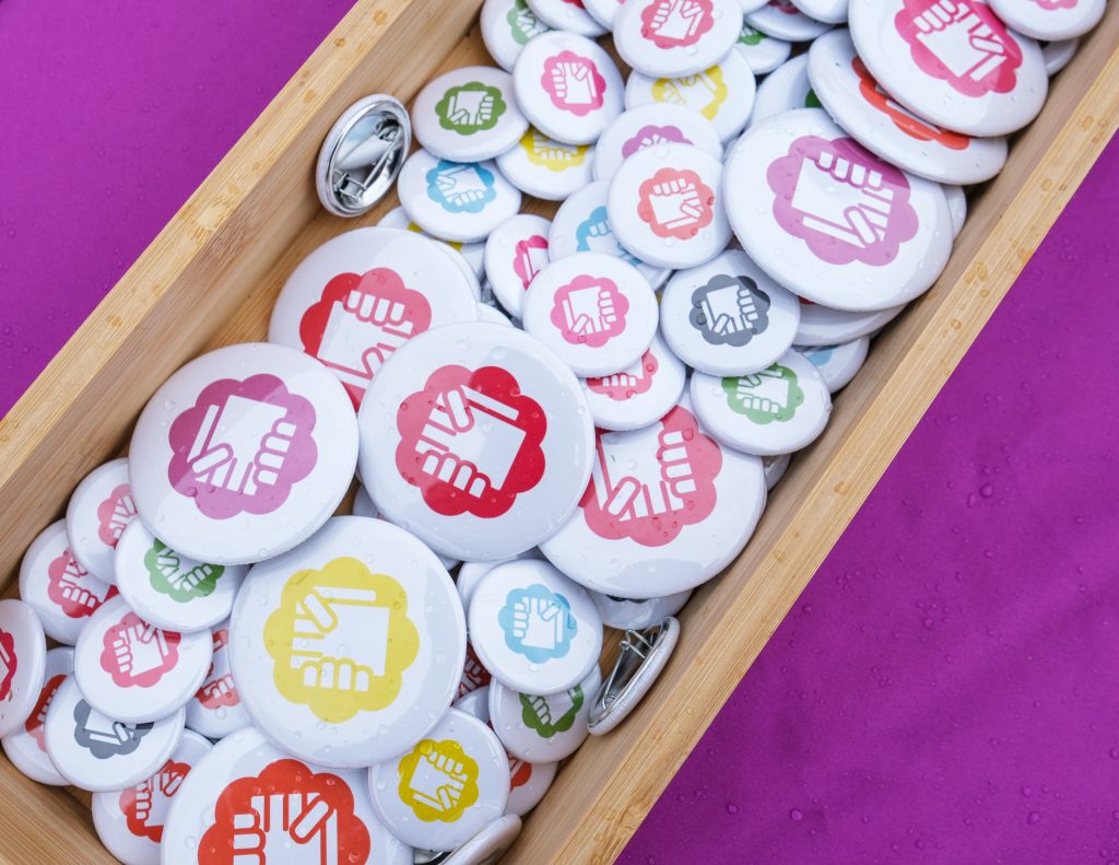
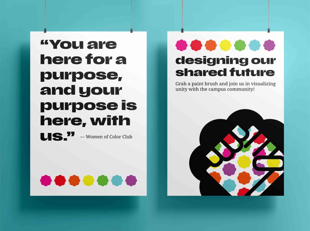
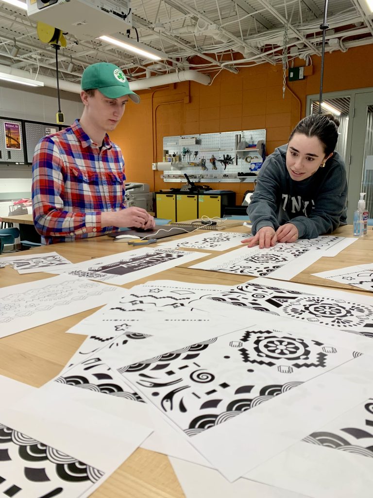
We also conducted semiotic studies of pattern, color, and repetition based on a quote gathered from WOCC, “You’re here for a purpose, and your purpose is here, with us.” These visual studies led to the creation of a single mural representing our collective effort to build a better campus and unified world for all students, faculty, and staff.
Through the symbols and patterns the design team created inspired by the affinity groups, the campus-wide community were welcomed to contribute their unique interpretation of unity to the mural.
promotional materials
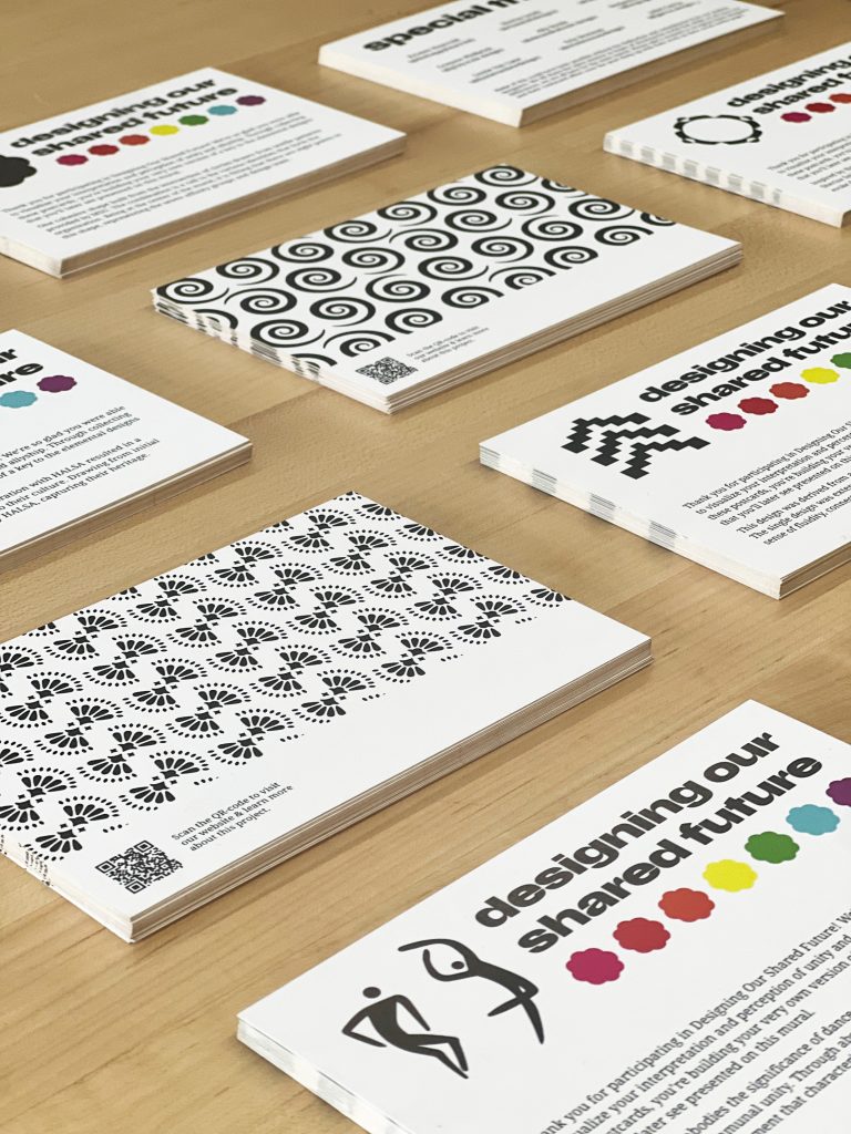
In exploring the concept of unity, our design team engaged in research with affinity-based groups across campus. From this collaboration, we curated bespoke symbols and patterns reflecting unity through diverse cultural, religious, and demographic perspectives. To generate interest and participation, I crafted posters aligned with our brand identity, drawing attention from passersby and effectively bolstering event attendance.
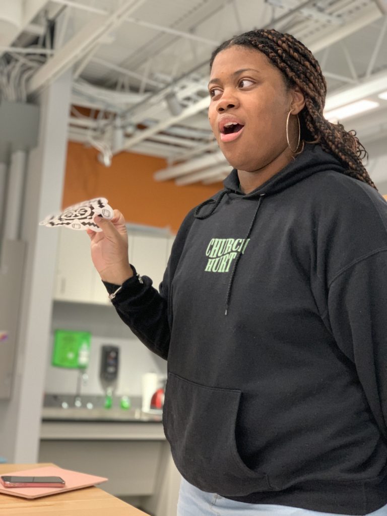
For the day of the event, I developed postcard takeaways for participants, serving as both inspiration and a curated guide to the symbolism embedded in each design. With detailed explanations provided, attendees delved deeper into the project’s goals and outcomes via a QR code linked to our website. This interactive approach facilitated further exploration and engagement with the themes of unity and diversity.
web design
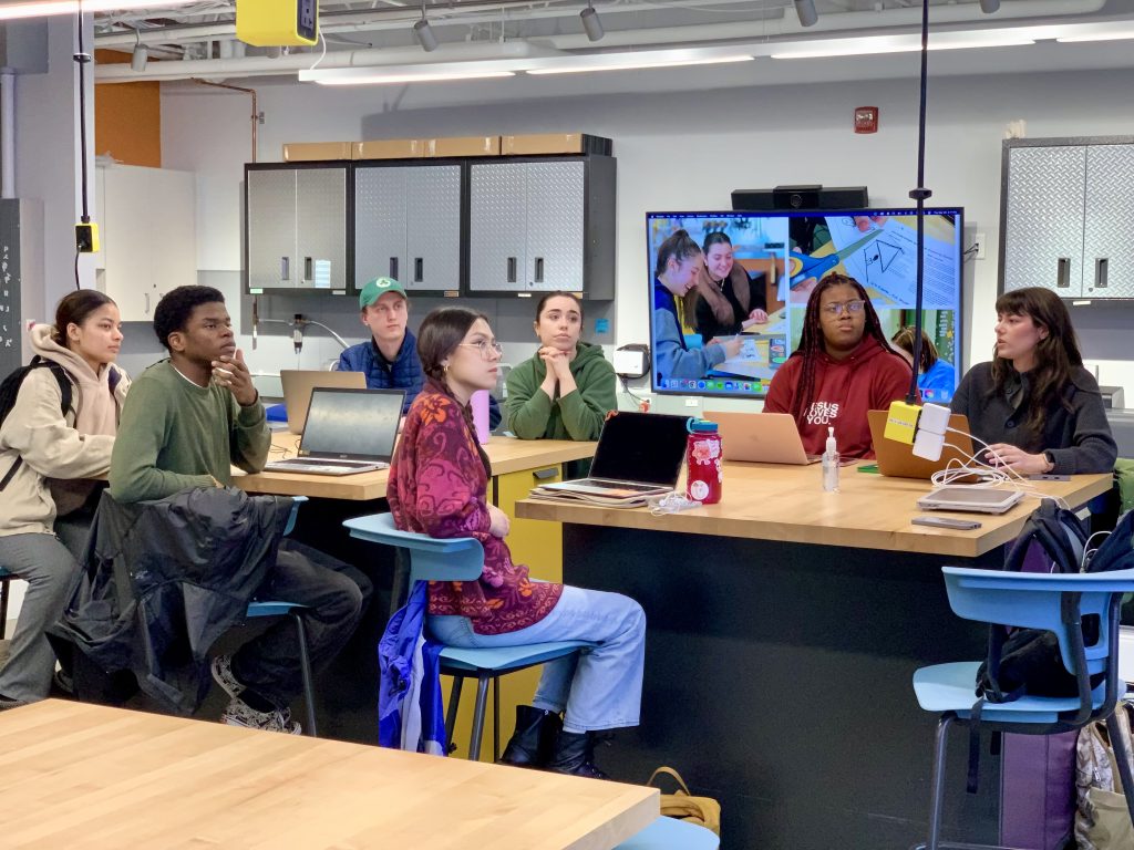
As a core aspect of the project, our team was committed to maintaining complete transparency, enabling both viewers and participants to gain insights into the project’s journey. This encompassed showcasing a multitude of tasks integral to the project, ranging from conducting interviews and constructing the piece, to curating designs tailored for each group, all the way through to the event day itself.
process
In collaboration with Sherisa Smith, Hannah Caple, Alexandra Houle, Ben Mosher, and Grayson Philbrick.
The process of this project included layers of collaboration, research, construction, and did I say collaboration? Our design team partnered with campus affinity groups, allowing each designer to choose one or two groups to collaborate with. Through interviews, questionnaires, and open conversations, we explored each group’s perspectives and needs related to the project.
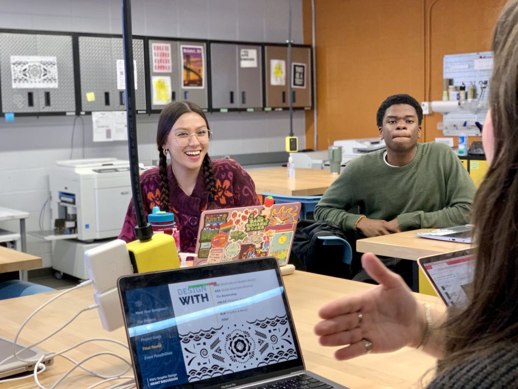
Once the research phase was complete, we transitioned into the production stage. Designers created patterns and symbols based on the insights gathered, iterating on their designs while continuing to collaborate with the groups. To ensure the participants felt deeply connected to the final designs, we held critique sessions for feedback, refining the patterns and symbols that would inspire the mural on painting day.
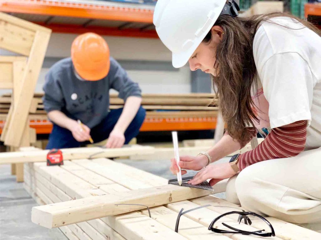
In preparation for the mural installation, we teamed up with the campus construction management club to help design and build the structure. They advised us on the best materials, and as the project was highly hands-on, our design team worked alongside them to construct and install the mural panels into their permanent location.
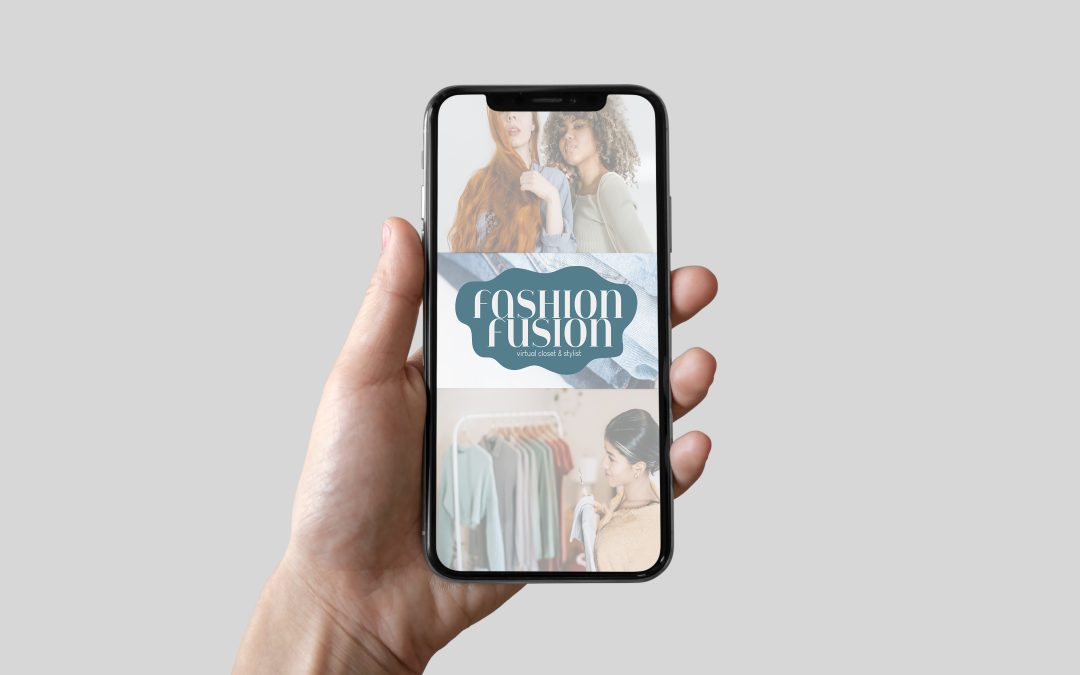
Fashion Fusion is an app that acts as your own virtual closet and personal stylist. By snapping a photo of your clothing items, it automatically adds them into your wardrobe. When you’re in a hurry or feeling a bit uninspired, the app can suggest and generate 3 outfit combinations based on your existing closet. It will use filters such as weather, occasion, and comfort level to cater to your outfit needs. It also has other features such as the shop tab where you can shop and buy pieces that are inspired by what you are loving. This will help expand your current wardrobe and overall help your fashion sense.
Our team of designers began on crafting a brand identity for the app, envisioning a gender-neutral space fit to all. From there, we meticulously designed screens, prioritizing accessibility, versatility, and overall effectiveness at every step of the process.
In collaboration with Jamie Goldman and Ella Waryas
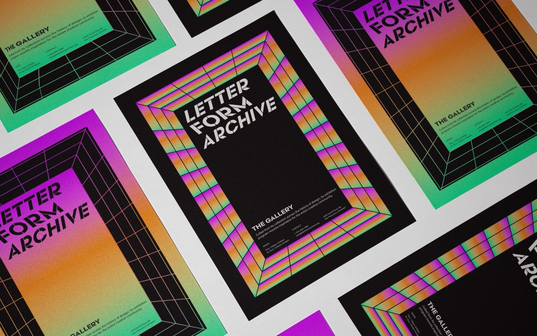
I crafted a fresh perspective for the Letterform Archive’s branding, emphasizing its educational and community-focused mission through a carefully devised color system and thoughtfully designed wordmark and logo. Green, orange, and purple were chosen to symbolize different facets of the organization’s identity, with depth and dimensionality imbued into the visual elements to reflect the richness of design history and creativity. The resulting brand deliverables present a cohesive narrative that resonates with the Archive’s multifaceted nature and commitment to inspiring and educating.